Six Ways To Improve Forms

One of our clients—a large life insurance company—sought our help to improve the way they gather client information for life insurance applications. We were tasked with shortening the time to complete the form while improving accuracy and the overall customer experience.
The Challenge
The company’s existing forms were time consuming and confusing, leading to a lot of inaccurate data collection. The instructions, terminology, and layout were hard to digest and users had little space to respond to detailed questions. This friction was exacerbated by unclear direction about which information was required. The resulting confusion and frustration often led to incorrect or incomplete answers—or worse, complete abandonment of the process and lost business.
The Solution
Even before diving into the dirty details of the form’s instructions and questions, we found valuable secondary research that could be used to improve information accuracy and collection. This research showed us that:
- People are generally more honest online
- When confronted with the legal ramifications of lying, and actively agreeing not to, people tend to tell the truth
- Making people answer a “yes” or “no” question before providing details leads to honest answers (Designing Usable Forms: Success Guaranteed, Robert Barnett, p.14)
Six Guiding Principles
As we tackled the challenge of improving the existing forms, we took a step back and identified some principles we would use as guideposts in our design.
First and foremost, we recognized that forms are generally unenjoyable. They can be cold, long, ambiguous, confusing, and poorly designed. This can lead to frustrating experiences and dramatic loss of sales. Expedia.com, for example, lost an estimated 12 million dollars in revenue because of one confusing, optional form field.
The following principles outline the specific ways we knew our design would save users time and effort and drive accuracy and honesty in the information gathered.
#1 Forms Should be a Conversation
Forms can be cold and impersonal. Our recommendations:
- Use a conversational, human tone to ask questions.
- Be conscious of the flow of questions. As much as possible, order questions logically as in a conversation and avoid asking questions that seem to come out of left field.
- Use a “one question at a time” interaction—this gives the form and its users room to breathe, answer questions, and describe details (i.e. avoid “Have you ever been diagnosed, tested positive for, or seen a doctor for Disease X?”—those are 3 different questions).
Need help with your business’ forms and customer experience? Drop us a note or give us a call.
#2 Forms Should be Intelligent
Forms can be frustrating when they ask the same questions multiple times, or when the questions are irrelevant. Our recommendations:
- Use intelligence to infer answers to questions (e.g., zip code auto-completes city and state).
- Make every attempt to determine whether questions are relevant before asking them.
- Skip questions that do not apply using dynamic skip logic.
#3 Forms Should be Lean
Forms can be long and cumbersome. Our recommendations:
- Pre-populate as much information as possible to avoid redundancy. Gather data from existing systems or third-party public or private resources.
- Whenever possible, ask for specific pieces of information only once—you might be surprised (or maybe not) by how often we see the same question repeated 3 times or more on a form. If it’s required in multiple locations for legal or other reasons, try to default with pre-populating and allow users to edit if they need to.
- Keep the number of optional questions at a minimum—or even better, don’t ask any.
- Make forms as short as possible.
#4 Forms Should be Transparent
Forms can be unclear, leading users to constantly ask, “why are they asking me this?” Our recommendations:
- Tell them why you are asking questions. Providing simple descriptions for why certain questions are necessary helps include users in your process rather than giving the impression you have a secret agenda.
#5 Forms Should be Helpful

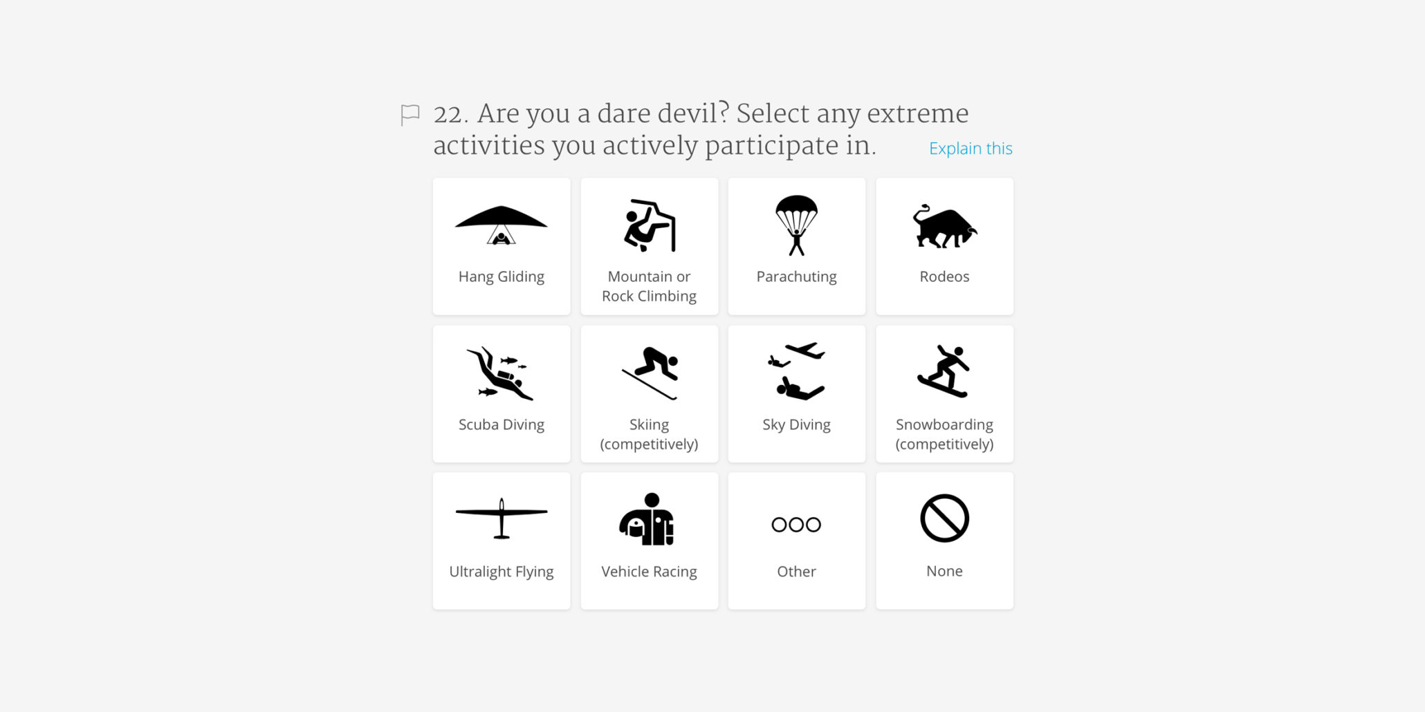
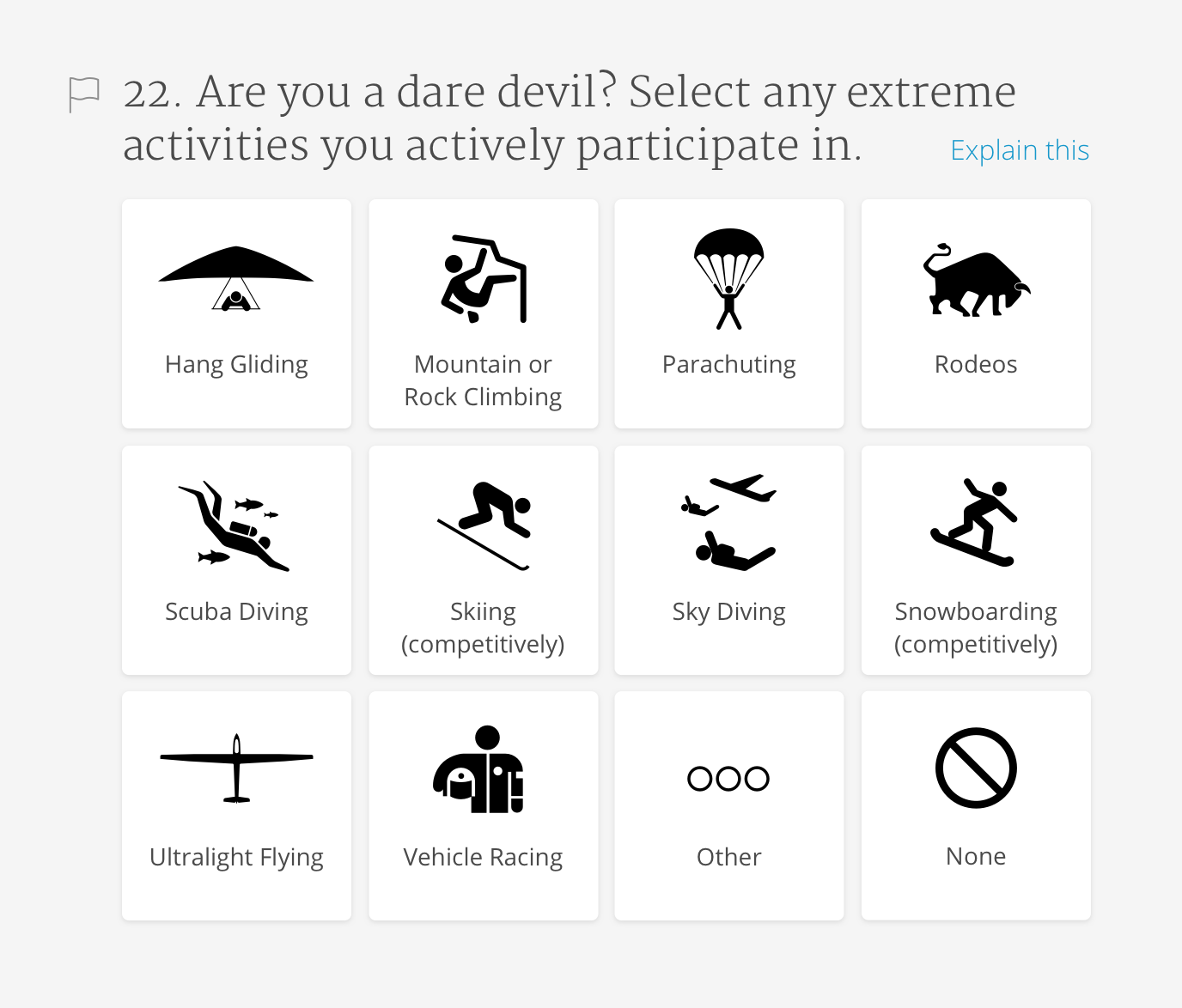
Forms can be confusing, and some terminology and wording may be unclear. Our recommendation:
- Provide explanations and descriptions to define terms. Better yet, avoid complex terminology and use everyday words.
- Use images.
#6 Forms Should be Beautiful
Forms can be poorly designed with little thought put into the importance of aesthetics. Our recommendation:
- Beauty isn’t an afterthought—it is a core quality of form design. Study after study has shown that interfaces that look better are easier to use.
These six guiding principles will help save users time and should promote more accurate data collection across paper, phone, and digital forms.
A big thanks to Jesse and Matt for their contributions to this post.
Additional Resources
People Are Actually More Honest Online Than In Person via Business Insider
Study: We All Tell Lies Over the Phone via abc News
Why We Lie via The Wall Street Journal
How Can We Make People More Honest? via Fast Company / Co.Exist


Send us a postcard, drop us a line
Interested in working with us?
We scope projects and build teams to meet your organization's unique design and development needs. Tell us about your project today to start the conversation.